With the launch of 13th Age, we required new artists – with The Eyes of the Stone Thief, the Free RPG Day release and Shadows Over Eldolan all ready as manuscripts, we had quite a backlog. Joshua Calloway, who I feature here, was one of the artists who emailed us a link to their portfolio.
We get about eight such emails a month, and about 20% meet the quality, genre and style criteria we are looking for. Of those who we then contact, about half jump through the hurdles of working for tabletop RPG rates and responding in a timely fashion. Then, another 50% of those who accept a first commission drop out, don’t deliver on time or in rare cases, don’t deliver work we can publish. If that is the case, they get a kill fee equal to 100% of the amount we promised. We do everything we reasonably can to work with inexperienced artists, build their confidence and improve their work. Joshua is experienced.
We’ve ended up with a stable of reliable artists, such as the brilliant Jérome Huguenin and the amazingly versatile Rich Longmore.
Rob Heinsoo worked with 13th Age editor Cal Moore to shape the adventure and the text, and he suggested the cover brief:
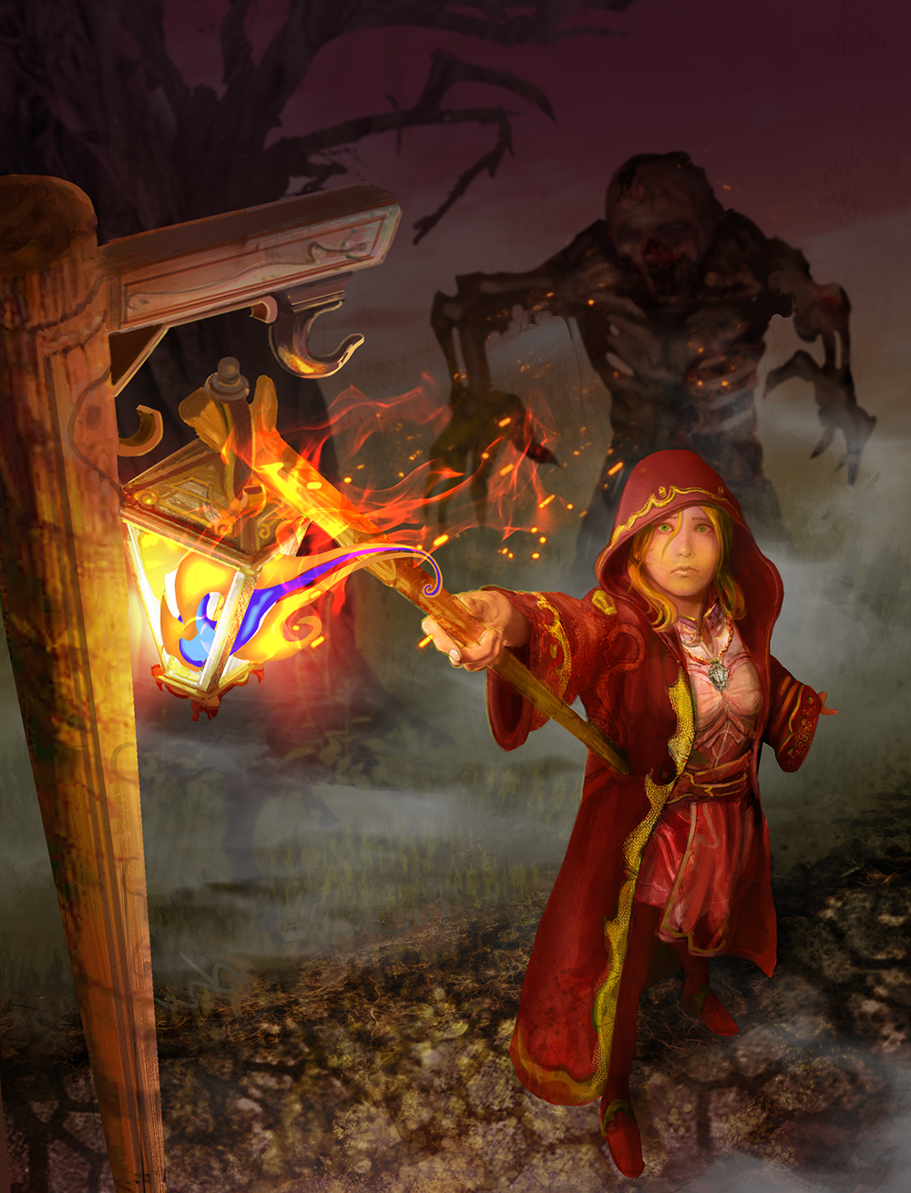
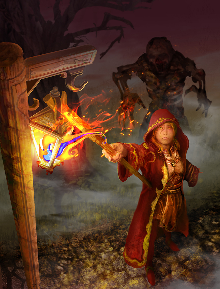
Female human or half-elf in a wizard’s cloak with a hood hangs an ornate wooden lantern on a high post with a long staff at night. The magical blue flame in the lantern is shaped like the Archmage’s symbol but it is guttering, sputtering, being blown sideways, and the woman’s face shows concern and worry…
She is not yet aware of the shadowy monstrous humanoid shape or shapes reaching for her from behind, hidden by the night’s shadows.
Rather than dictate the monster of the piece, I’m willing to let the artist use one of the following choices:
EITHER multiple half-armored skeleton warriors, possibly doing the classic rise-from-the-earth shtick
OR
a giant misshapen flesh golem with one over-sized arm and one twisted undersized arm
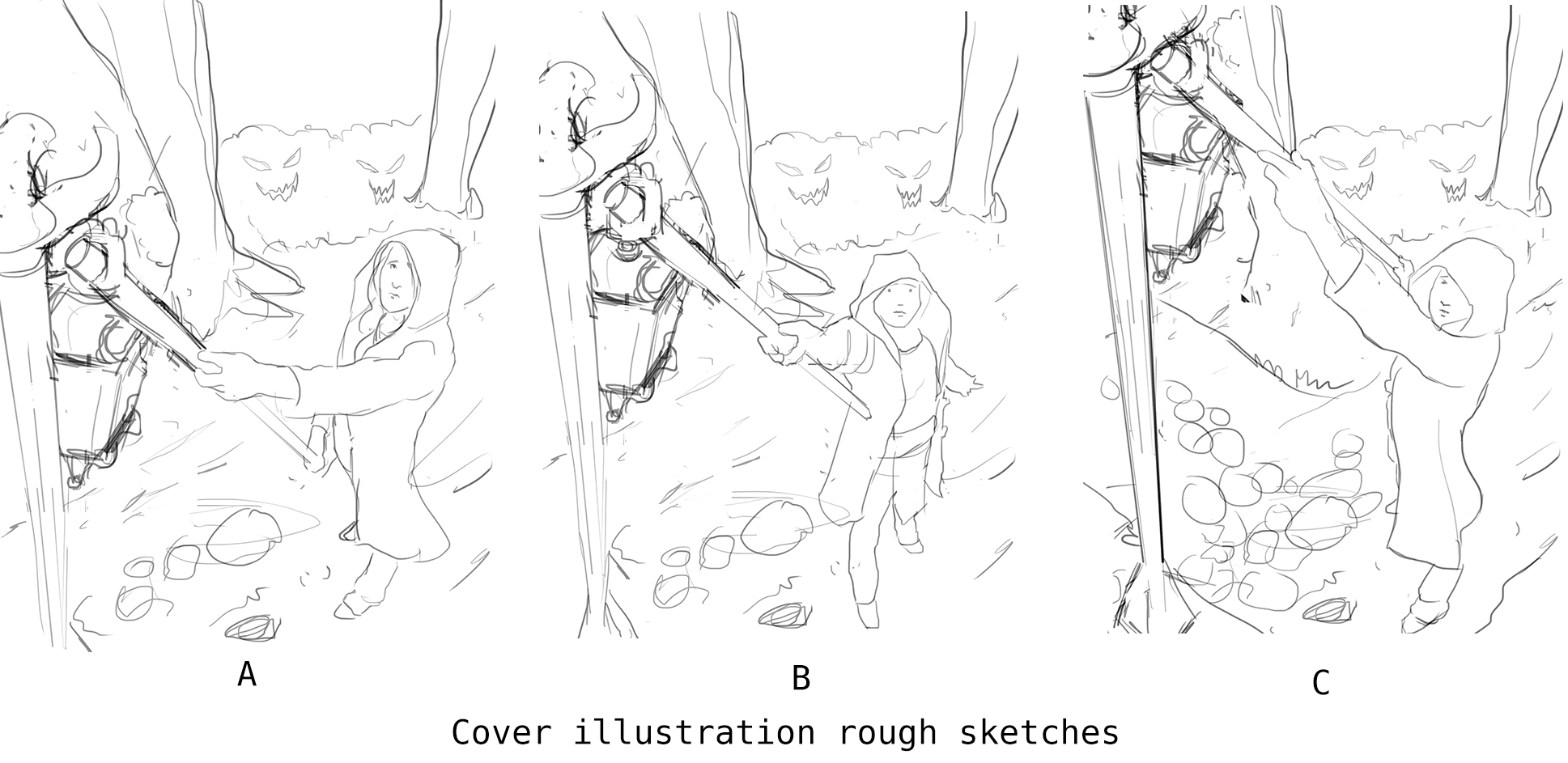
Cat Tobin as the art director for the project assgned it to Joshau, then worked with him to create the cover. Joshua started with a selection of rough sketches.
Cat said:
These are really cool, thanks! I prefer [B], with a couple of minor changes/requests – her cloak should be full-length to her ankles and slightly baggier around the arms, more like this. Under the cloak, she should be wearing sensible (i.e. non-revealing, non-fitted) clothing, maybe something like this and leggings – it looks from the sketch like you got that already. It would be good to make the flame slightly more obvious as it will be quite a recognisable shape, and if you could keep a space somewhere in the image for the title, that would be great.
From his response, you can see that Joshua has clearly worked on covers before – some covers are a right pain to add title text and other furniture:
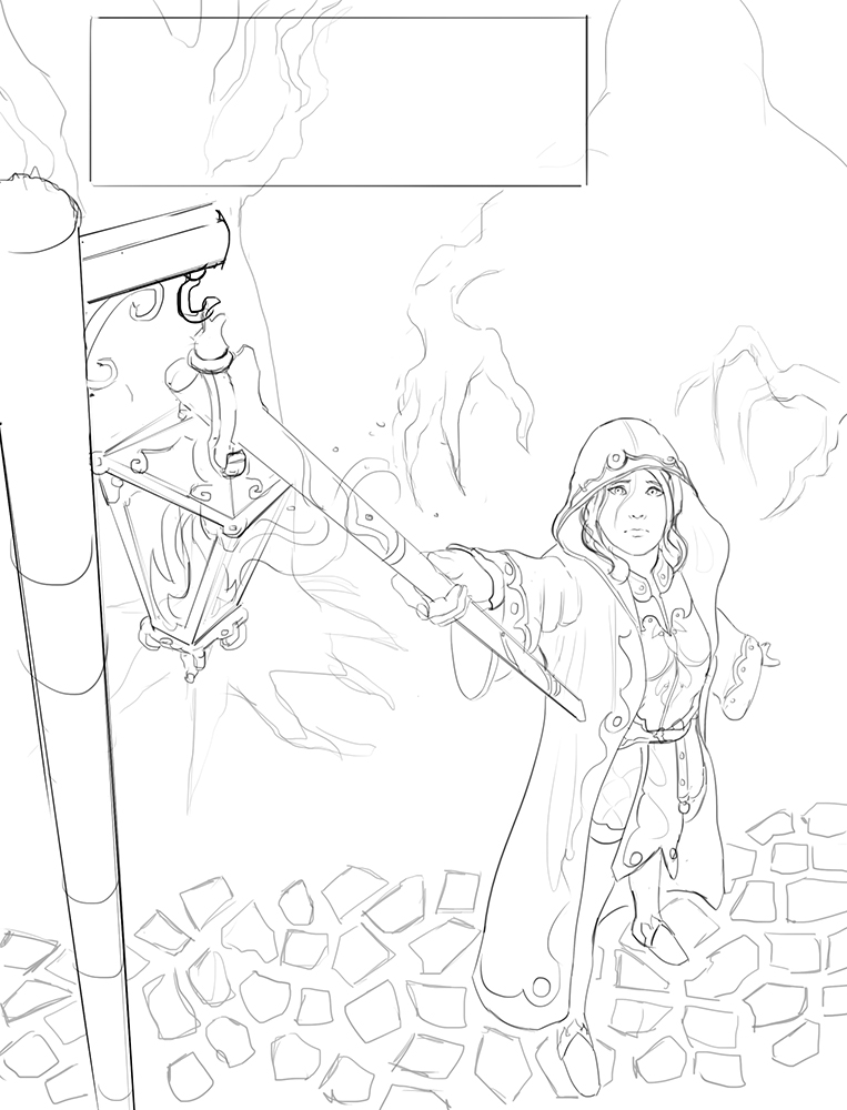
Here is the line art to review. I placed a box at the top where the title could potentially go. I can keep the upper area of the image mostly dark except the lantern of course so the values should be close enough for the title to be placed over the tree nicely. Otherwise I can take the tree out, but I thought the roots resembled the shadowy claws making the image that much more creepy.
This really does match the brief. Some artists are over-eager to send us nearly finished pieces, which can cause extra work, but Joshua is taking a sensible step-wise approach. Cat said:
Regarding the shadowy figures in the background, they should be mostly shadow but could they be shadowy zombies instead of generic monsters, please? I should really have clarified that in the art direction, sorry about that.
Also, a bit more detail about her cloak – it’s great the way you’ve got it; it should be rust-coloured, and there should be a Lamplighter’s Guild patch (a lantern), embroidered in either gold or silver on the shoulder visible in the picture, and there should be lanterns embroidered on the cuffs and around the edges (in the place of the circle detail you’ve currently got). Also, if you could give her a brass-coloured chain around her neck with a lantern on it, that would be awesome (don’t worry about it if it would look too finicky, it’s more a nice-to-have).
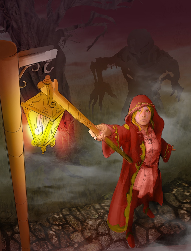
This is looking lovely. It would be great if you could make the shadowy figure slightly darker, so it stands out more (we’ll need this in 300-pixel size for previews, so it would be great to have it visible even at that scale), and also if you could pick out the Archmage flame symbol a bit more; maybe by adding a blue-y colour to the heart of it like a gas fire, or some warmer oranges/reds to the heart and the outline so the shape is more distinctive. It would be good if it was slightly more of a sideways shape, too, like it’s being blown to the side in the wind – again, that’s something it would be good to do with the colouration.
This is an important point. Covers must look goood at 200px across for display on websites such as rpgnow.com, as well as at full size on the shelf.
Here is Joshua’s updated version:
After a bit of feedback from Rob (basically, darken the back arm) and final polish, here is the final. It’s an excellent piece of work which can stand proudly beside the 13th Age, 13 True Ways and the 13th Age Bestiary.

